A New Digital Story for a Nonprofit Changing Thousands of Lives Across India
Website Redesign
Projected Mentorship Expansion 27% Growth
Mission Alignment- Funding 8000 students
Background
Kiran Foundation is a non profit organization based in India, that uplifts exceptionally talented students from underprivileged backgrounds through its flagship Kiran Pratibha Program—while also empowering women nationwide via the Kiran Shakti Program’s free skill-building courses and workshops.
The Challenge
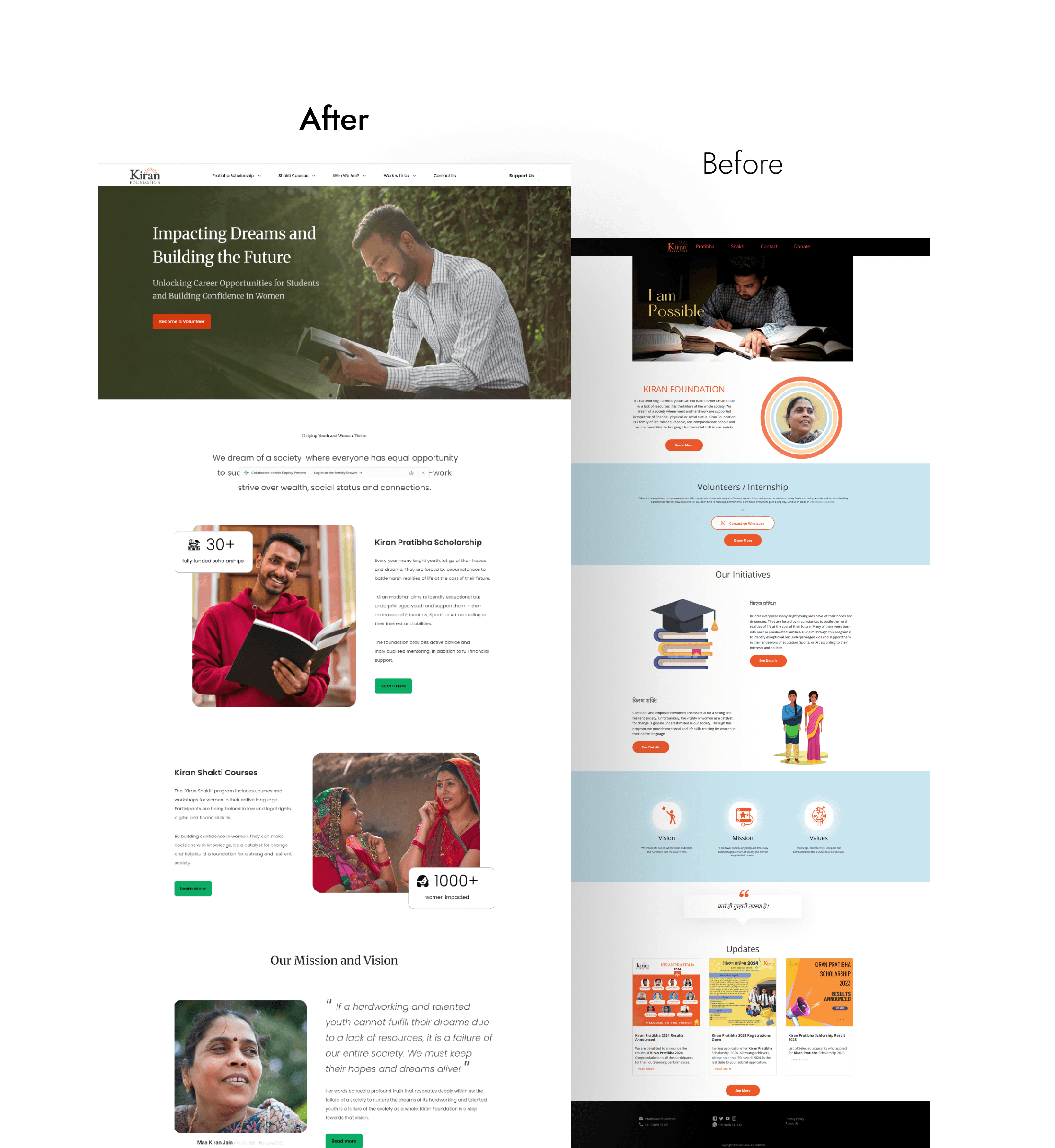
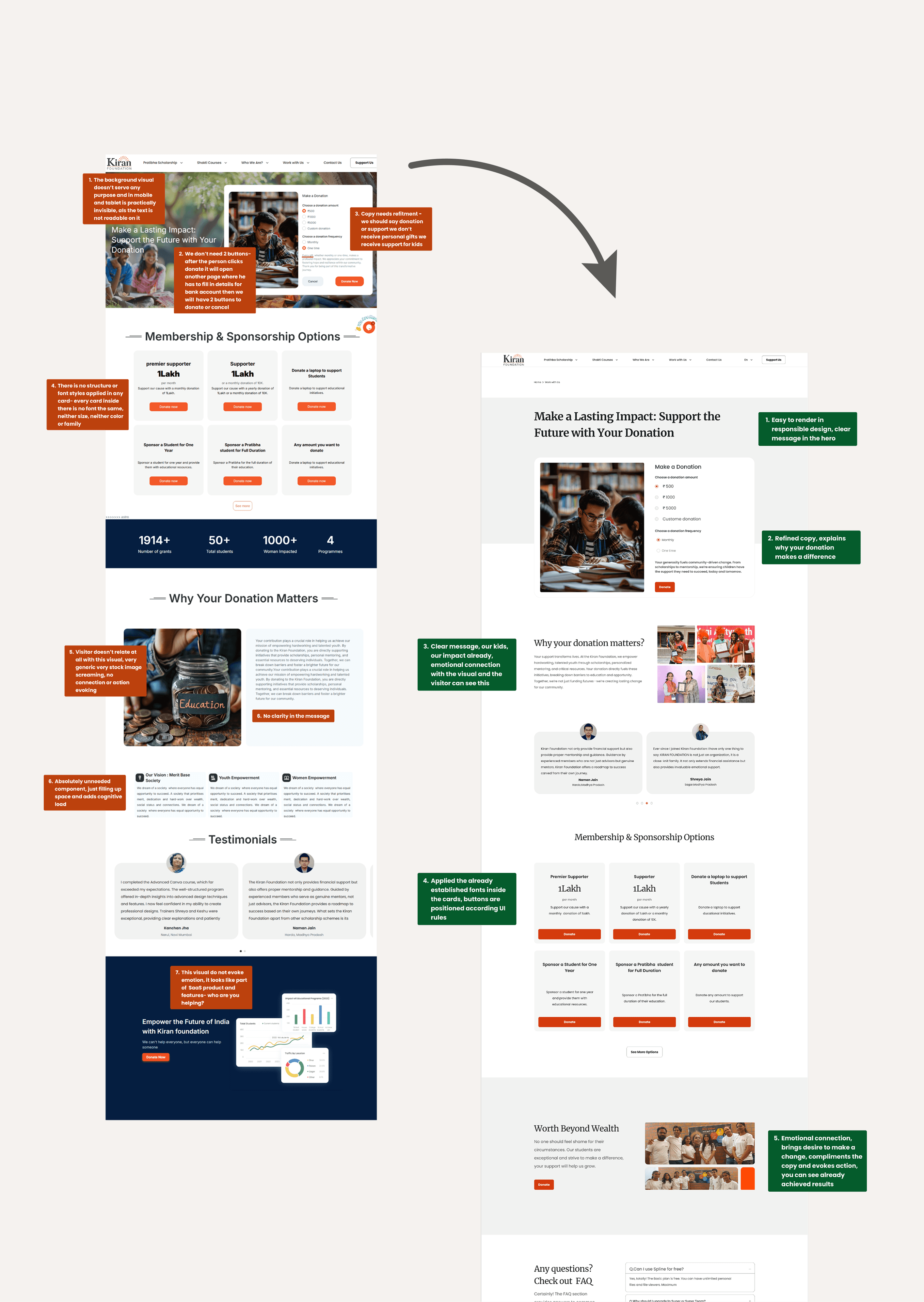
The existing Kiran Foundation website lacked usability, emotional resonance, and structural clarity, which limited its ability to build trust, communicate impact, and support the foundation’s growth and outreach goals. There was a redesign version in progress but it didn't serve the foundation's goals.
Services
UX Audit
User Research
Content Strategy
UX Copy
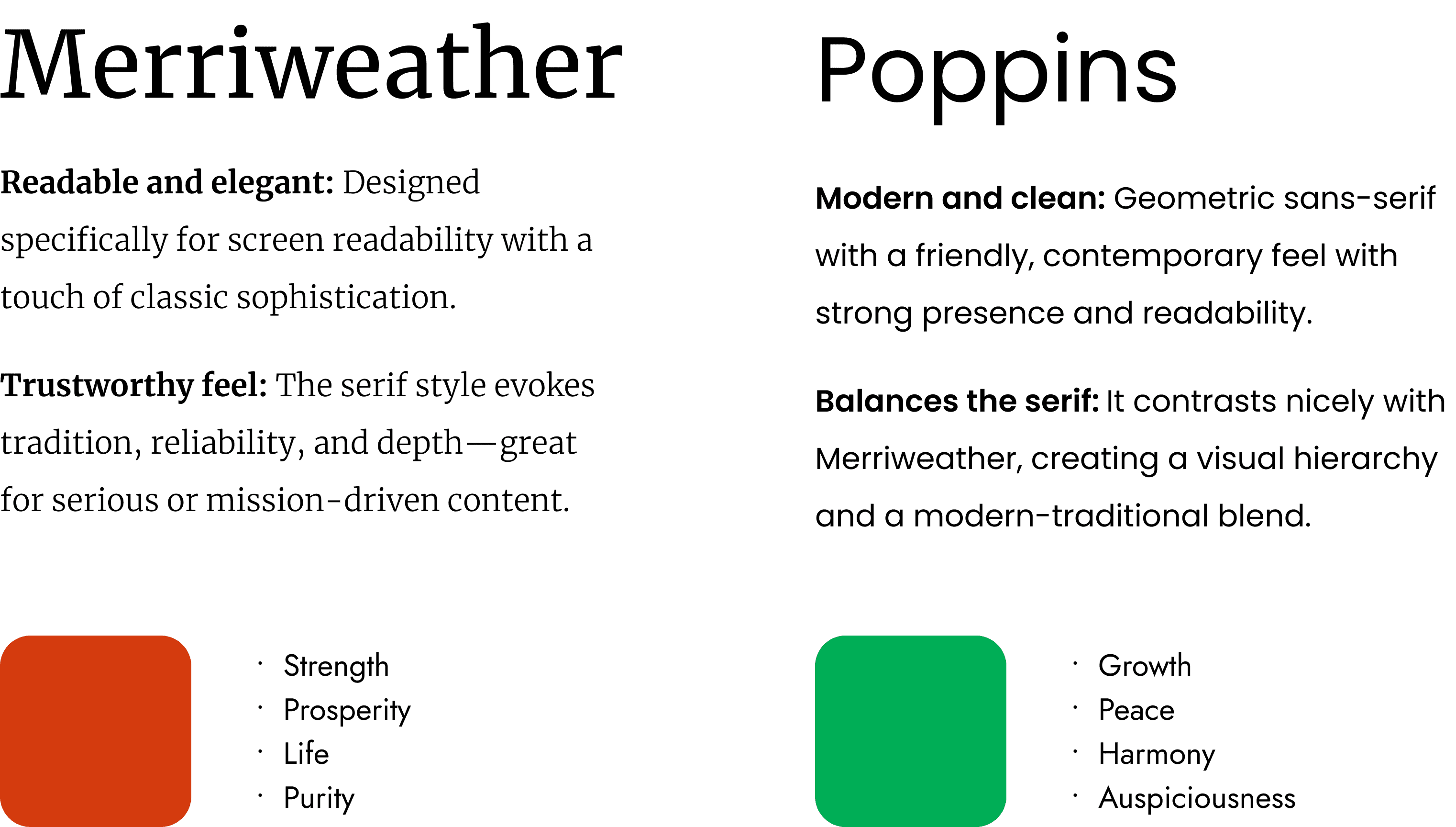
Visual Design
Web Design
My Role
Lead Designer
Timeline
February 2025- June 2025
Projected Impact
67% increase in the number of students supported with scholarships
27% Mentorship Expansion Growth
Goals
Constrains
Tight timeline and fixed deadlines
Required use of pre-made Bootstrap components
Limited flexibility for creative exploration and custom design solutions

Process
[01] User Research
Hotjar Analysis: Studied user behavior patterns to identify usability gaps
Stakeholder Interviews: Collaborated with program leads to understand the organization’s story, audience, and long-term goals
Content Audit: Reviewed existing copy to identify inconsistencies and missed storytelling opportunities

[02] Insights
Homepage Drop-off: Heatmaps revealed a high exit rate on the homepage, suggesting users weren't finding what they needed quickly.
Weak Call-to-Actions (CTAs): CTAs were either missing or unclear, leading to low engagement and conversions.
Navigation Issues: Users got stuck in subpages due to unclear structure; key pages were missing or hidden from the main menu.
Unclear Messaging: Website copy lacked clarity and direction, making it hard for users to understand the Foundation’s mission or next steps.
Content Overload: Text-heavy sections with little visual support made the site hard to scan and digest.
Lack of Storytelling: The emotional impact and human side of the Foundation’s work were missing, reducing user connection.
Ineffective Visuals: Existing visuals didn’t support or enhance the message, and failed to reflect the real impact or community.
Outdated Course Info: Information about the Kiran Shakti Program was incomplete, unclear, and not regularly updated.


[03 Design Solution & Delivarables]
Updated sitemap for improved navigation
Refined, mission-aligned website copy
High-fidelity visual designs created in Figma
Custom visual assets (real imagery + graphic elements)
Annotated design files with UX reasoning and decision logic


Next Steps
User Interviews
Engage potential users through interviews and usability tests on the existing site to uncover areas for improvement
User Engagement
Utilize Hotjar to gain insights into user behavior, measure the success of updates, and inform ongoing UX improvements.
SEO Optimization
Audit performance, accessibility, and SEO, and to highlight areas needing improvement with Google Light House
